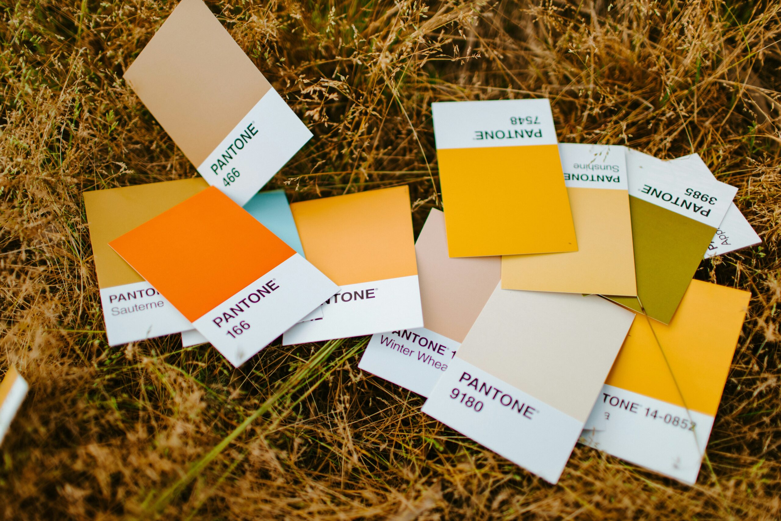
The Gold Standard: How Call-To-Action Colors Guide Action
We talk a lot about Call-to-action (CTA) buttons and their microcopy in marketing. Click Here! Buy Now! Get Started! But an often-overlooked part of a CTA that clients, designers, and sometimes even marketing agencies don’t think about is its color.
CTA color is not about picking something pretty or visually interesting. It is both psychological and design based. It’s about visibility, expectation, and behavior. The right color makes it obvious where to click and helps people feel comfortable taking the next step. The wrong color blends in, creates hesitation, or gets ignored.
At Wild Iris Marketing, we choose CTA colors very intentionally. Here is how we think about it and why it matters for your site.
CTA Colors Are About Conditioning, Not Tricks
Color psychology is often talked about as if there are strict and universal rules. Red means emergency or urgency. Green means go. Blue means trust. In practice, CTA colors work because of conditioning more than just simple psychology.
Over time, users learn what certain colors usually mean on a website. When they see those colors, they recognize what to do without even consciously thinking about it. Familiar patterns reduce friction, and reduced friction leads to more clicks.
A perfect example of this type of conditioning is Amazon.
Why Amazon’s Gold Still Works
Amazon has trained users that a gold or warm yellow button means “this is how you move forward.” Add to Cart, Buy Now, and Continue.
Gold itself is not inherently persuasive. It works because Amazon is ubiquitous and has consistently reinforced that color as the action trigger for years. When users see a similar color elsewhere, that learned behavior carries over.
This does not mean every website should copy Amazon exactly, but it does show that familiar patterns help users move confidently through the customer journey on a site without second-guessing what they’re supposed to do.
Why Green Often Signals a Safe Next Step
Green is a CTA color that frequently performs well, especially in bright shades.
Culturally, green is associated with approval, confirmation, and progress. Think traffic lights, check marks, and success messages. In a website environment, green often feels reassuring and comfortable, not pushy or gimmicky.
Green CTAs work particularly well when the action is framed as a positive step forward, such as scheduling a consultation, requesting information, or submitting a form. It feels like the visitor is getting the opportunity to say “yes,” not just performing a required action.
Other Common CTA Colors and How They Tend to Be Perceived
While gold and green are strong options, they are far from the only ones that work. What matters is how a color is commonly experienced by users and how it fits into the rest of the site.
Blue is widely associated with trust and stability, which is why it appears so often in professional services, healthcare, and software. As a CTA color, blue often works well for low-pressure actions like “Learn More” or “View Details.” A challenge we often consider when using blue is that it is common and heavily used across the web in designs, so it can easily disappear if it is not clearly differentiated from the rest of the design.
Orange feels energetic and encouraging without being as aggressive as red. It often works well for CTAs that encourage momentum, such as “Get Started” or “Continue.” When used sparingly, it can feel friendly and motivating. If overused, it loses impact.
Red immediately draws attention, which makes it useful in very specific situations. Limited time offers or urgent actions can sometimes benefit from red CTAs. However, red is also associated with warnings and errors, so one must be careful as it can be off-putting or cause hesitation if used too much or without context.
Black or very dark buttons can communicate confidence and authority. They are often effective for premium brands or minimalist designs where restraint is part of the business’s identity. These buttons require thoughtful design choices and careful contrast to remain clearly clickable.
White or very light CTAs are sometimes used in clean, minimal designs, as on Nike’s website. They rely heavily on outlines, shadows, and placement to signal interactivity. When done well, they feel elegant. When done poorly, they look like plain text and might just get skipped.
Standing Out Matters More Than the Color Itself
Contrast in many cases is the most important reason for an individual color choice.
If your CTA button is the same color as your headers, backgrounds, or decorative accents, it is less likely to get clicked. An otherwise well-chosen color can still fail if it blends too much into the other colors on the page.
At Wild Iris Marketing, we always evaluate the full site palette before choosing a CTA color. The button should be visually distinct and usually is specifically reserved for actions. If everything is highlighted, nothing is.
This is why using one brand color for everything seems like a neat design idea but can actually hurt conversions. A dedicated “action” color creates clarity and an obvious way to move forward.
Accessibility Is a Vital Part of Good CTA Design
Contrast is never simply a design choice or preference. It directly affects two incredibly important part of website design: usability and accessibility.
If a CTA does not have sufficient contrast, some users literally cannot see it clearly. This includes users with visual impairments and users viewing your site on mobile devices, especially in bright conditions, among others.
Buttons that are easy to see are easier to use. Ease reduces friction, and reduced friction increases how often people will push that button.
CTA Color Is About Reducing Hesitation
A CTA button is not responsible for convincing someone to act. That work should already be done by your messaging, layout, and content.
The button’s job is to remove any confusion or hesitation at the final moment. A clear, familiar, high-contrast CTA makes visitors feel safe. They know instinctively what to do next. When CTA colors are chosen well, users do not think about them at all. They just click that button!
How We Approach CTA Colors at Wild Iris Marketing
We do not choose CTA colors based on design trends or personal preference alone. We look at how a site is structured, how users move through it, and what emotional tone makes sense for the action being taken.
That includes evaluating existing brand colors, contrast, accessibility, and consistency across pages. The goal is always clarity and action.
Don’t Hand Over the Keys to Your Marketing.
There is no such thing as a “best” CTA color.
Gold works because it is familiar. Green works because it feels affirmative. Blue works because it feels safe. Other colors work when they are chosen intentionally and used with thoughtfulness.
What matters most is that your CTA stands out, feels appropriate, and makes the next step obvious.
If you are unsure whether your CTAs are helping or hurting conversions, Wild Iris Marketing can help evaluate color, placement, and messaging so your site guides visitors naturally toward action instead of making them hunt for it.


