We Know Looks Aren't Everything. So Why Does Bad Design Cost Customers?
A new visitor to a website forms their first impression in somewhere between five and ten seconds. Believe it or not, before they’ve read a single word of all that meticulously written content, they’ve already formed an opinion about your business, and that opinion is based almost entirely on what they see.
Today’s blog focuses specifically on graphic design: logos, visual identity, color, and typography. If you want explore how design functions within your website’s user experience, check out our UX Roadmap series, and if you’re thinking about brand consistency across all your channels, check out Does Your Brand Look Like the Same Business Everywhere? This post is about the basic visual building blocks used in both of those topics.
Design is not superficial. It’s deeply human. We process visual information much faster than text. Tens of thousands of times faster. Our brain assesses what seems trustworthy based on visual cues long before our conscious mind catches up. A business that looks polished and professional gets a different first impression than one that doesn’t, regardless of whether the underlying product or service is identical.
Strong graphic design isn’t a luxury or a “nice-to-have.” It’s foundational to your marketing.
What Does Graphic Design Actually Do?
Most people think of graphic design as making things look pretty. That’s a a part of it, albeit a small one. The biggest part of graphic design is communication.
Good graphic design communicates who you are before anyone reads your About Us page. It signals whether you’re established or new, premium or budget, lighthearted or serious, trustworthy or questionable. It guides the visitor’s eye to what matters most. It helps to create consistency across every visual touchpoint so that a customer encountering your business on social media, your website, or a printed brochure gets the same impression from each.
Bad graphic design, or even just the absence of intentional design, communicates too. But it won’t be what you intend. A logo that looks like clip-art, fonts that make no sense together, colors that aren’t chosen for any real reason, and images that are low resolution or inconsistent all look unprofessional. Even more importantly, they create doubt, and doubt is the biggest enemy of customer conversion.
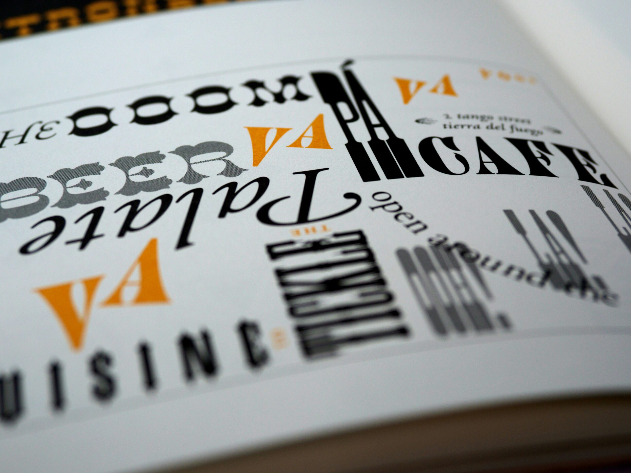
The Logo is Your Visual Foundation
Your logo is the single most important visual element your business can have. It shows up everywhere (or at least it should). It should be on your website header, your social media profiles, your email signature, your invoices, and your signage, and it sets the visual tone for everything that follows.
A well-designed logo has to do a lot of things. It should be distinctive enough to be memorable. It should be simple enough to work at any size, whether on a tiny social media profile image or a large banner. It should reflect things about your business: its personality, its industry, and its values, all without being a cliché. It should reproduce nicely in both color and black and white, and at both large and small scales.
Many businesses start out with a logo that was done quickly or on a budget or made by someone who kind of threw it together as they went. There’s really no shame in that. Everyone starts somewhere, and an early-phase basic “whatever” logo is much better than no logo at all. But as your business grows and its digital presence becomes more central to how customers find and evaluate you, that early logo can hold you back. Refreshing your logo at the right time can have an immediate positive difference in the perception of your business.
Typography and Color Shape Perception
Most business owners don’t really think much about fonts. Design professionals think about them a lot.
Typography is the selection and use of fonts. It shapes how readers experience your content before they’ve read a single word. Certain fonts feel authoritative, others feel friendly, some dated, and some modern. The right font reinforces exactly the impression you’re trying to make, while the wrong one can create a subtle friction that readers may or may not be able to articulate, but will definitely feel. Would you put your money in a bank that wrote everything in “Comic Sans?”
Color works the same way. Beyond brand consistency as we’ve covered in other blogs, color carries psychological traits that operate largely below the conscious mind. Blues feel trustworthy and calm, greens feel fresh and natural, reds create urgency and energy, and warm neutrals like beige and taupe feel comfortable and grounded. Of course none of these are absolute rules because context and execution matter, but they’re real tendencies that professional designers understand and work with intentionally. The colors in fast food restaurants are often red and yellow for a reason.
We wrote a blog about how color choices affect customer behavior in The Gold Standard: How Call-To-Action Colors Guide Action, which goes into detail on how specific colors influence whether visitors will take action on your site.
When typography and color are chosen carelessly or just by default, the result is a visual identity that doesn’t really add up to anything. When they’re chosen with deliberation and skill by someone who understands what they’re doing, they reinforce everything else your marketing is trying to communicate.
Looks on Social Media
Graphic design has become unavoidable for most businesses because of social media. The visual bar on social platforms has risen dramatically over the past decade as more and more businesses focus on it. People scroll quickly, and the content that stops them and makes them take a look is the content that is most visually compelling.
This doesn’t mean every social media post needs to be a big, professional production. But it does mean that the visual elements of your social presence like your profile image, your cover photo, and the graphics you use in posts contribute to the overall impression your business makes to an increasingly online audience. Inconsistent, low-quality, and DIY images can undermine even the best content.
Well-designed templates that match your brand standards go a long way toward helping this. They create visual consistency across your media feed, make the content itself easier to produce, and ensure that your social media presence looks intentional rather than just thrown together.
Does Your Design Need a Makeover?
Not every design decision requires professional help. Simple content updates, straightforward social media posts, and small tweaks are all easy enough with the right design tools and a clear sense how things should look for your brand.
But there are situations where professional design expertise makes a meaningful difference. Are you designing or refreshing a logo? Establishing a visual identity for your business from scratch? Redesigning your website? Or do you think your current visual identity is causing problems for your business? These all call for expert help.
The difference between professional design and amateur design isn’t always obvious to the untrained eye. But it’s there. Customers who encounter professionally designed materials consistently form better impressions, trust businesses more readily, and convert at higher rates. The research on this is consistent.
At Wild Iris Marketing, we can promise you professional, engaging design. If your visual identity feels like it’s holding your business back, or if you’re not sure whether your current design is working as well as it should, we’re happy to take a look and get your design going in the right direction.