
When an Event Flyer Tells You Everything Except What You Need to Know
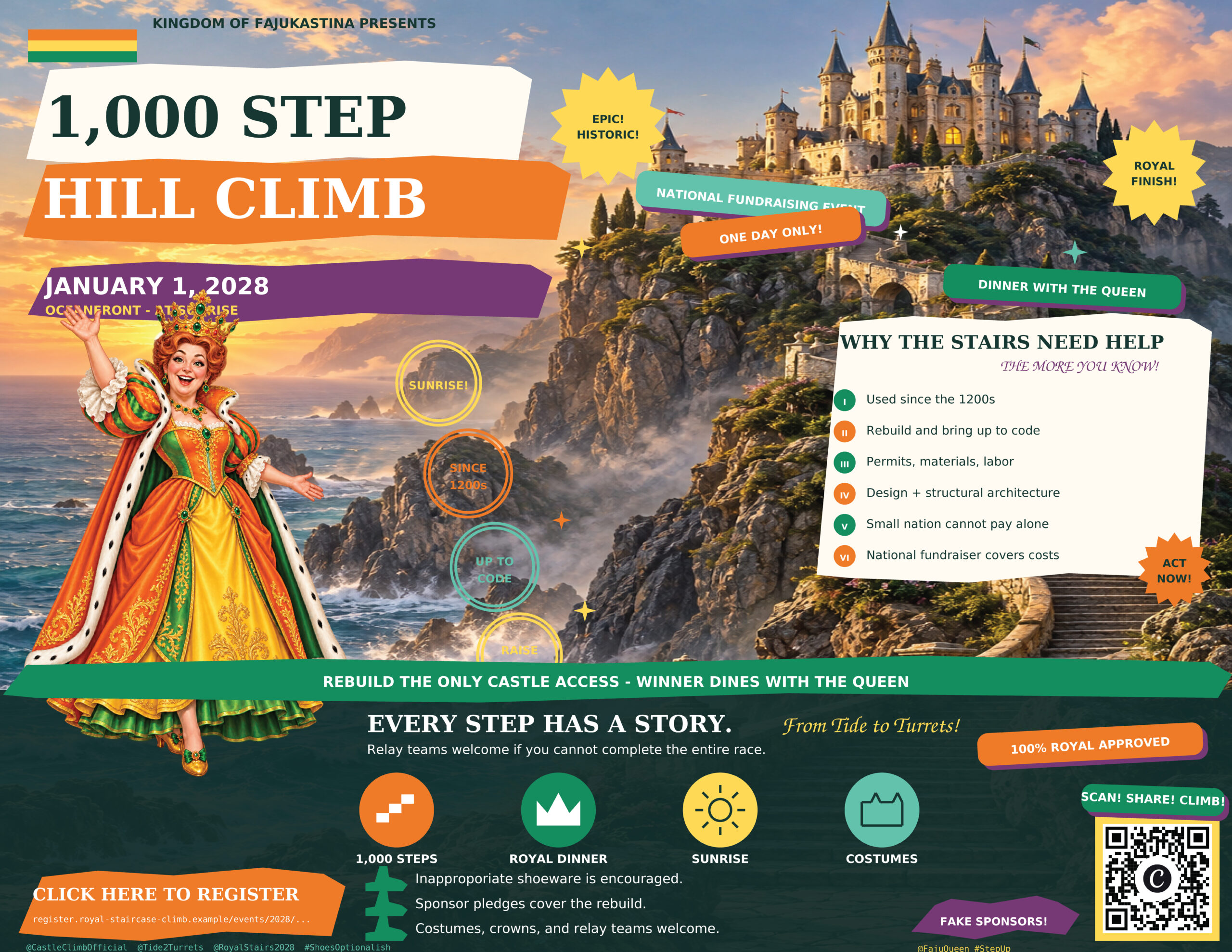
You have probably seen one. An event flyer packed with dramatic images, bursts of color, three different fonts, a variety of clipart, sponsor logos, a QR code, and callouts promising an unforgettable experience. It may even look beautiful at first glance. Then you try to answer a simple question: What time does it start?
The flyer has somehow given you too much information and not enough information at the same time.
AI makes flyers easier to put together than ever. Ask it to create a poster for a community event or fundraiser and it can fill every open space in seconds. It adds bullets, illustrations, badges, ribbons, extra details, and phrases that sound exciting. The result can feel finished before anyone has checked whether a person, seeing it for tow or three seconds can understand the basics.
Who is hosting it? What is happening? When and where is it? Why should someone attend? How do they participate? Those questions are the job of an event flyer. Every design choice should help someone find the answers.
More information does not automatically make a flyer more useful. A reader may see a schedule, a list of activities, several calls to action, a sponsor section, and a paragraph about the cause, fancy logos and photos yet miss the date because it appears in the smallest type on the page. If the location is merely a caption under a photo or the registration instructions are split between a QR code and a long URL, the reader has to work to figure out what to do. Most people will not put in that effort.
QR codes deserve particular attention. AI-generated images can include convincing-looking codes that do not scan or lead anywhere useful. The same is true of invented web addresses and phone numbers. A realistic-looking element is not a verified one. If the flyer will be printed, test the code from the final file at the size it will appear on paper. Check the destination, and give people a short, readable web address in case they cannot scan it.
There is also a difference between useful detail and visual noise. A relay option, dinner with a special guest, or an unusual prize may be exactly what persuades someone to sign up. Those details deserve a place on the flyer. But when each gets its own starburst, icon, bullet, and slogan, they compete with the important event details. The reader cannot tell which message matters most.
Before you publish an AI-generated flyer, step away from it and look again as someone who knows nothing about the event. Give it five seconds. Can you name the event, date, time, place, organizer, and next step? Then look at it on a phone, where many people will first encounter it. If you have to zoom or hunt for any of those answers, revise it. Ask another person to try the same exercise; the person who wrote the prompt already knows where everything is supposed to be.
AI can be a wonderful brainstorming partner. It can suggest visual directions, help tighten copy, and give a designer a starting point. But it cannot decide whether the final poster communicates clearly to your particular audience. That takes a human review of the facts, the reading order, and every link or code you expect people to use.
An effective flyer can be colorful, playful, and even gloriously busy. It just needs to make the essentials impossible to miss. If someone walks away remembering the graphics but cannot tell a friend when or where to show up, the flyer has missed its purpose.
At Wild Iris Marketing, we think the best event marketing does more than catch the eye. It helps people understand the invitation and act on it.